@media를 사용하면 화면 크기에따라 반응하는 사이트를 만들 수 있다
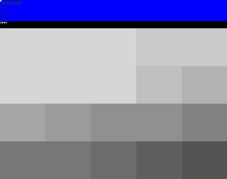
예)화면이 1599px 이하일 경우, 배경색을 blue, 글자색을 whith 적용
화면이 1280px 이하일 경우, 배경색을 greenyellow, 글자색을 whith 적용
//width≤1599px
@media screen and (max-width:1599px){
    body {
        background: rgb(0, 0, 255);
        color: rgb(255, 255, 255);
    }
}

//width≤1280px
@media screen and (max-width:1280px){
    body {
        background: rgb(173, 255, 47);
        color: rgb(255, 255, 255);
    }
}
기본값을 하나씩 변경하는 느낌으로 코드를 넣어줍니다.
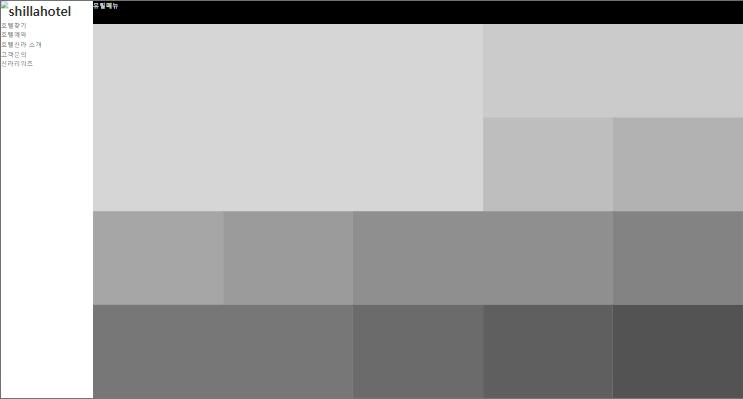
기본 화면일 경우 (1600px 이상)
.wrap {
    padding-left:200px;
}
header {
    position: fixed; top: 0; bottom: 0; left:0;
    width: 200px;
}
.nav-utill {
    height: 50px;
    background: $b;
    color: rgb(255, 255, 255);
}
.container {
    height: calc(100vh - 50px);
}
반응하는 화면일 경우 (1600px 미만)
@media screen and (max-width:1599px){
    .wrap {
        padding-left:0px;
    }
    header {
        position: static; top: 0; left:0; right: 0;
        width: 100%; height: 150px;
    }
    .container {
        height: calc(100vh - 200px);
    }
}
'반응형 웹사이트 > Shilla Hotel' 카테고리의 다른 글
| 779px <width ≤1023px (0) | 2021.01.26 |
|---|---|
| 1280px < width ≤ 1599px (0) | 2021.01.26 |
| line-awesome 이미지 animation으로 무한 회전 시키기 (0) | 2021.01.26 |
| 카드형 레이아웃 만들기 - PC버전 (0) | 2021.01.25 |
| SCSS - calc() : 너비, 높이 연산으로 구하기 (0) | 2021.01.25 |


댓글